Giving Lagos State’s Emergency Platform the Urgency It Needed
Andersen brought me in after earlier designers fell short, the homepage and dashboard never told the right story. I started by auditing the whole system first.
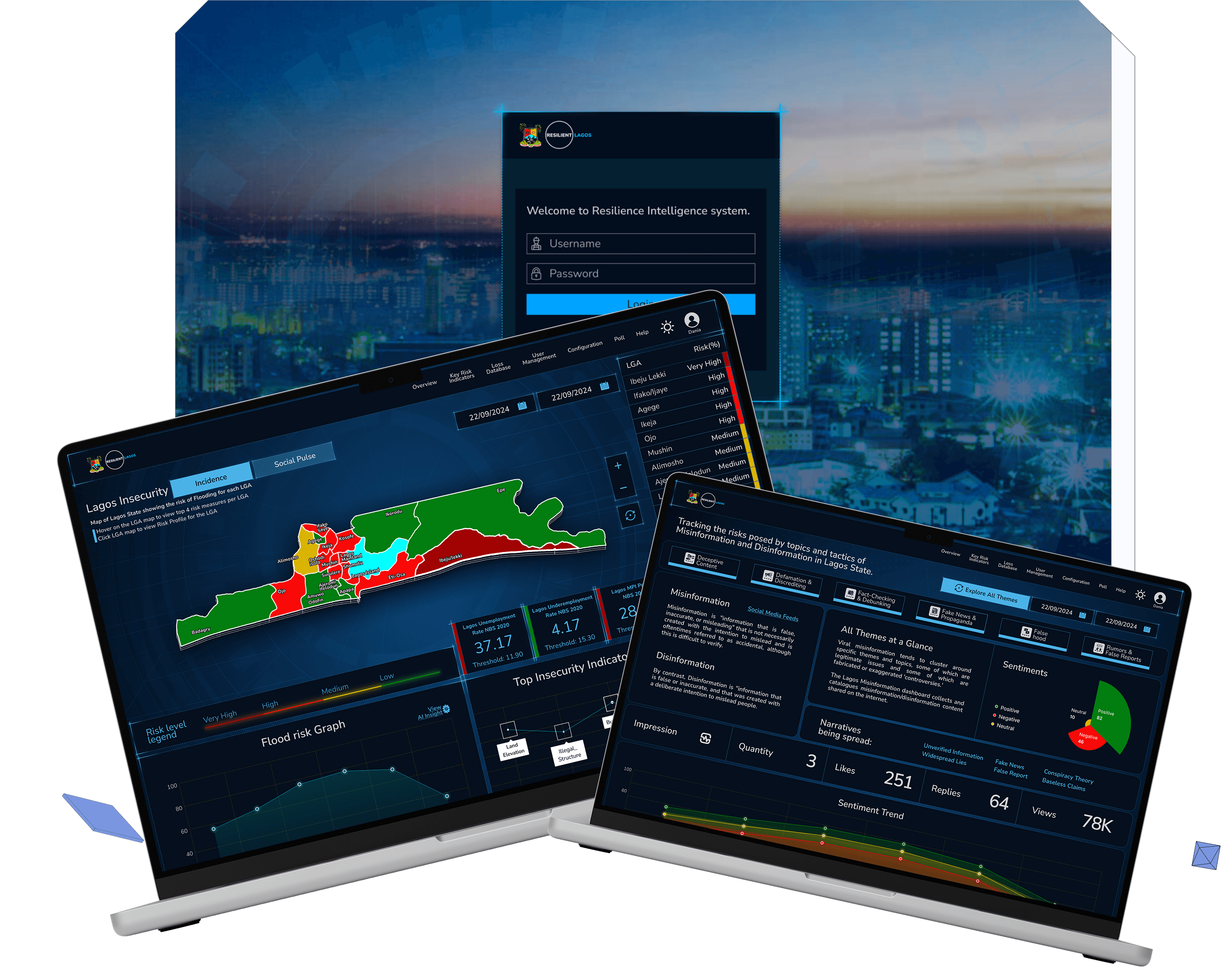


Goal
LASRO had already brought in a few designers before me, and the platform still wasn’t landing, the homepage didn’t feel urgent, and the dashboard didn’t tell a clear story. Before touching a single screen, I audited the whole system, the logo, the colors, the modules, and sent Andersen a full breakdown of what wasn’t working, and why.
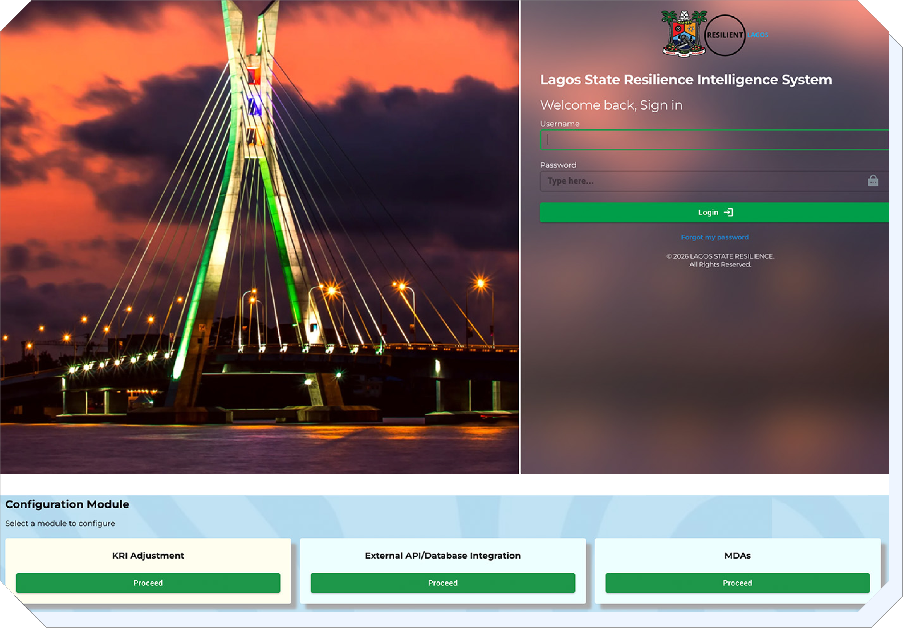
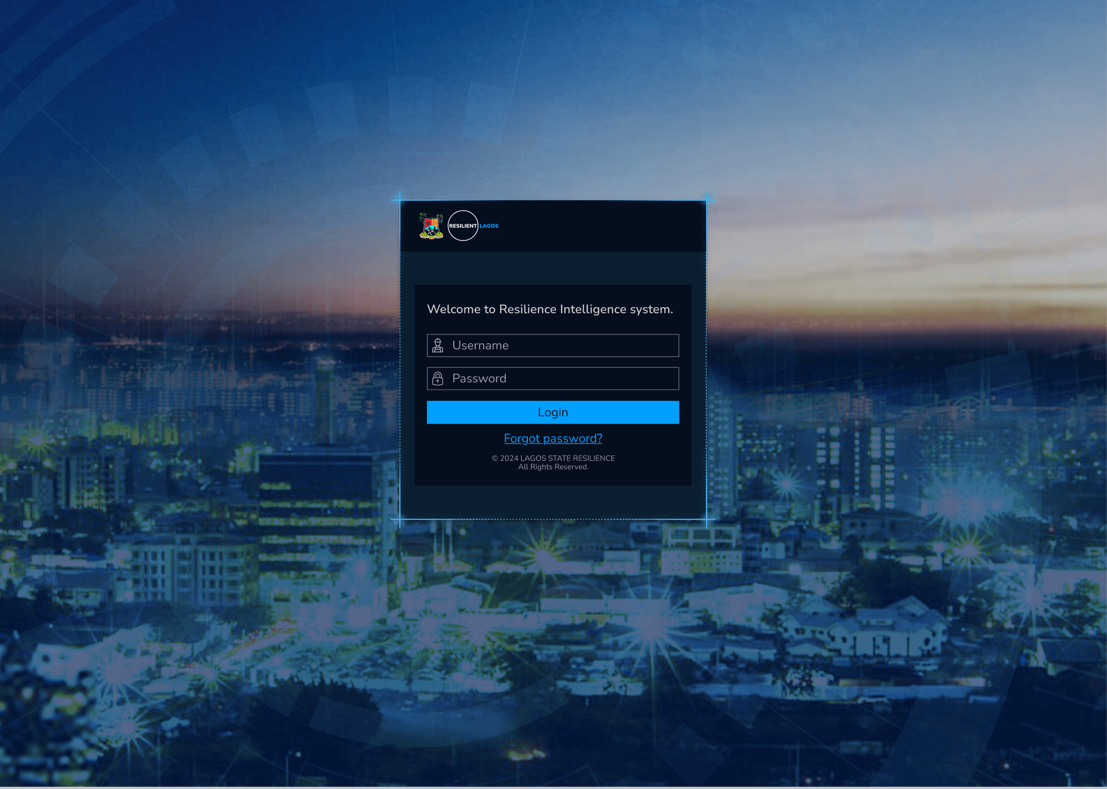
That’s the platform I inherited, a Login page built around a stock photo of the Lekki-Ikoyi bridge that said nothing about resilience, sitting above a config screen with a calm, water-like background that never read as urgent. My audit flagged all of it: the stock image, the color palette, the module placement, even the word cloud, before I redesigned a single screen, so Andersen knew exactly what was changing and why.

The part i’m obsessed with
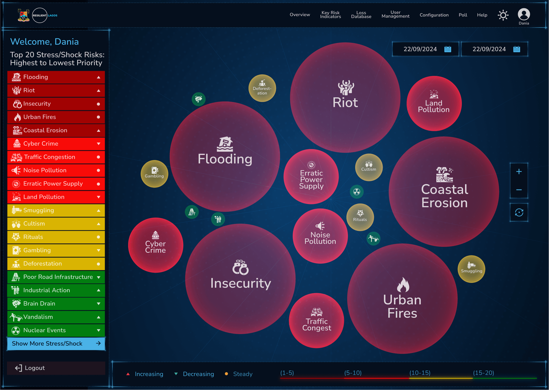
The bubbles were just perfect. I wanted someone to glance at the screen and just know what’s bad right now, no reading required. So whatever’s rising fastest, flooding, riots, erosion, gets big and red and sits in the middle.
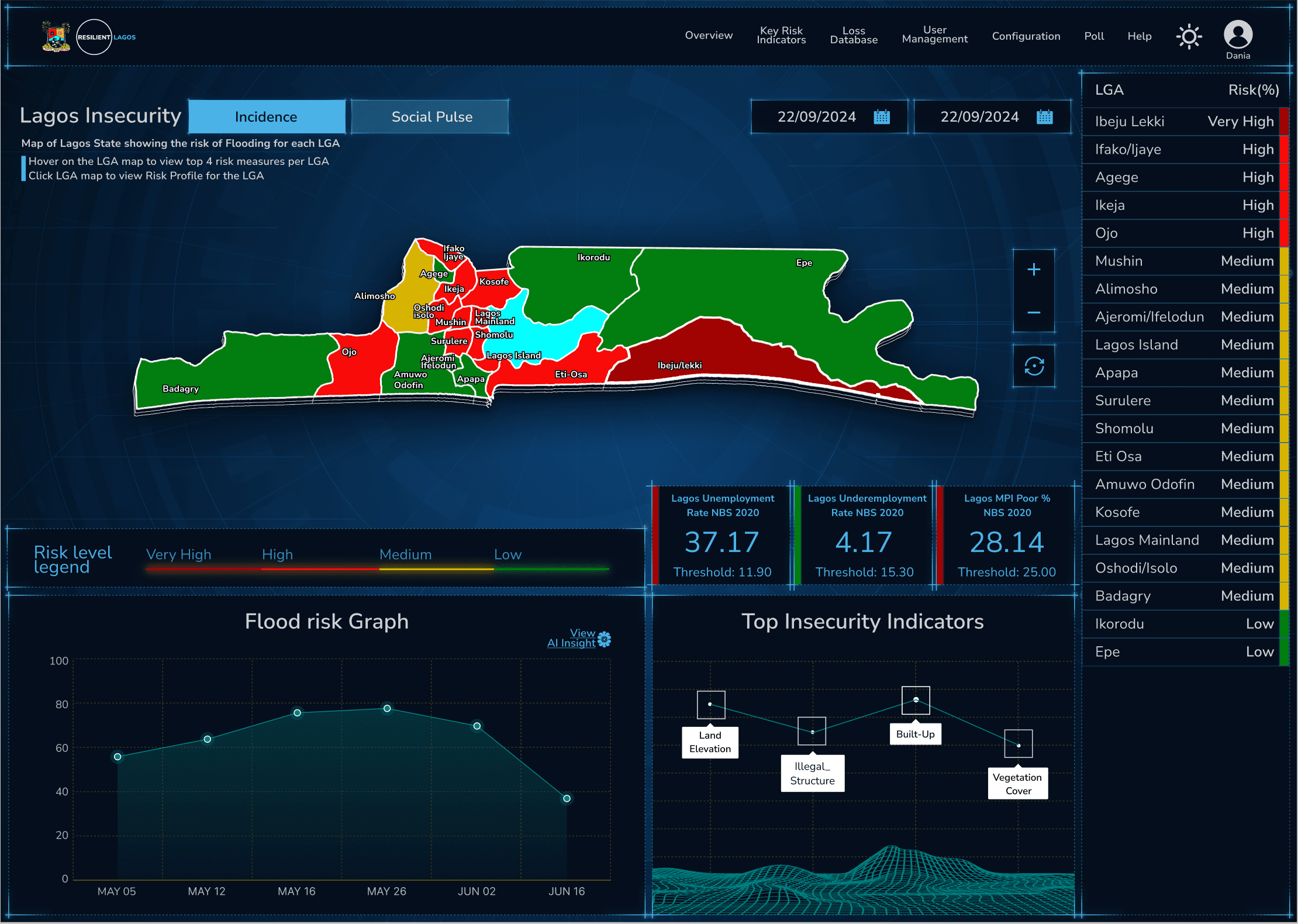
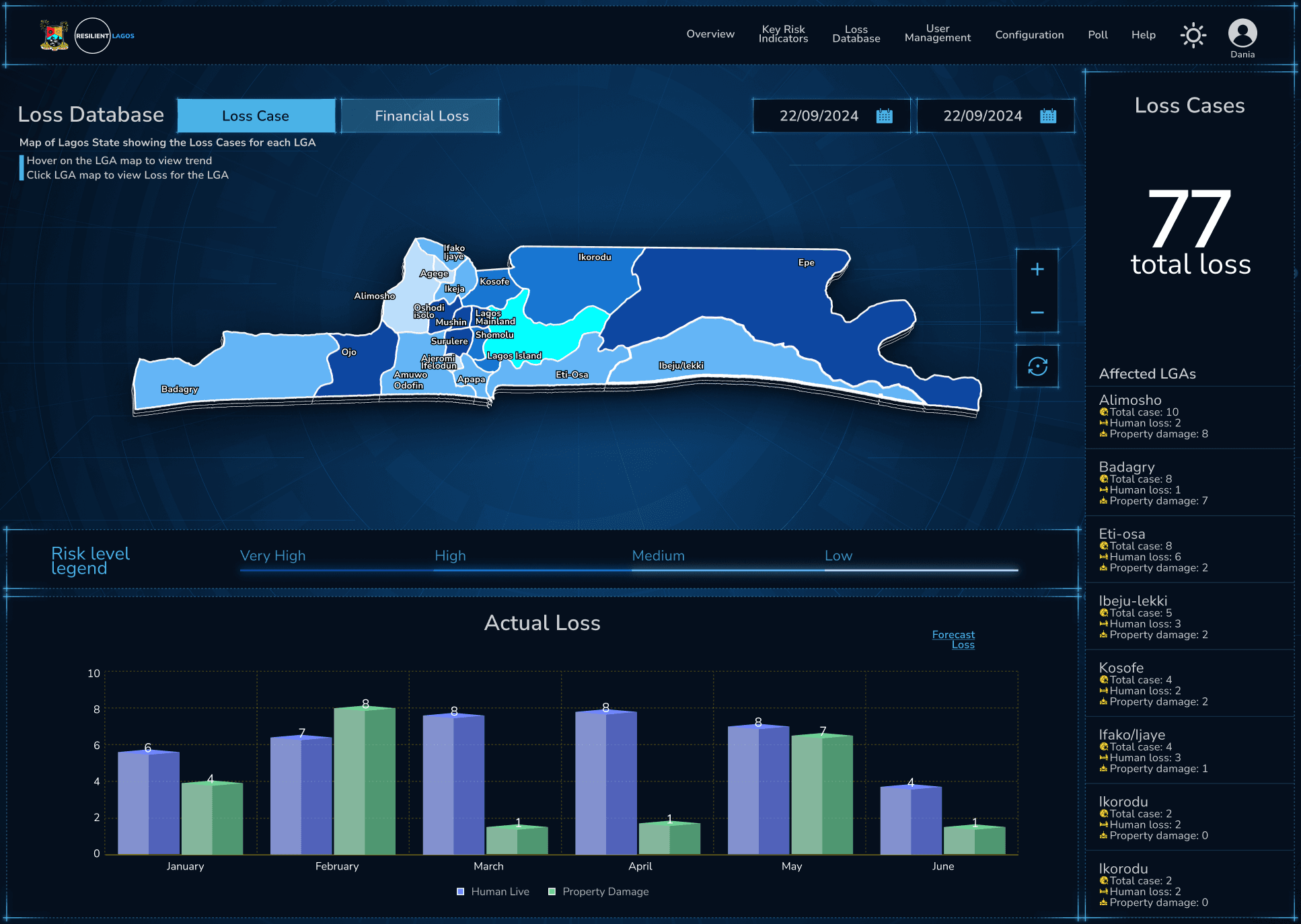
Click a bubble and it opens up every local government, ranked by risk. That data used to be stuck in a table you had to scroll through forever. Now it’s just right there.
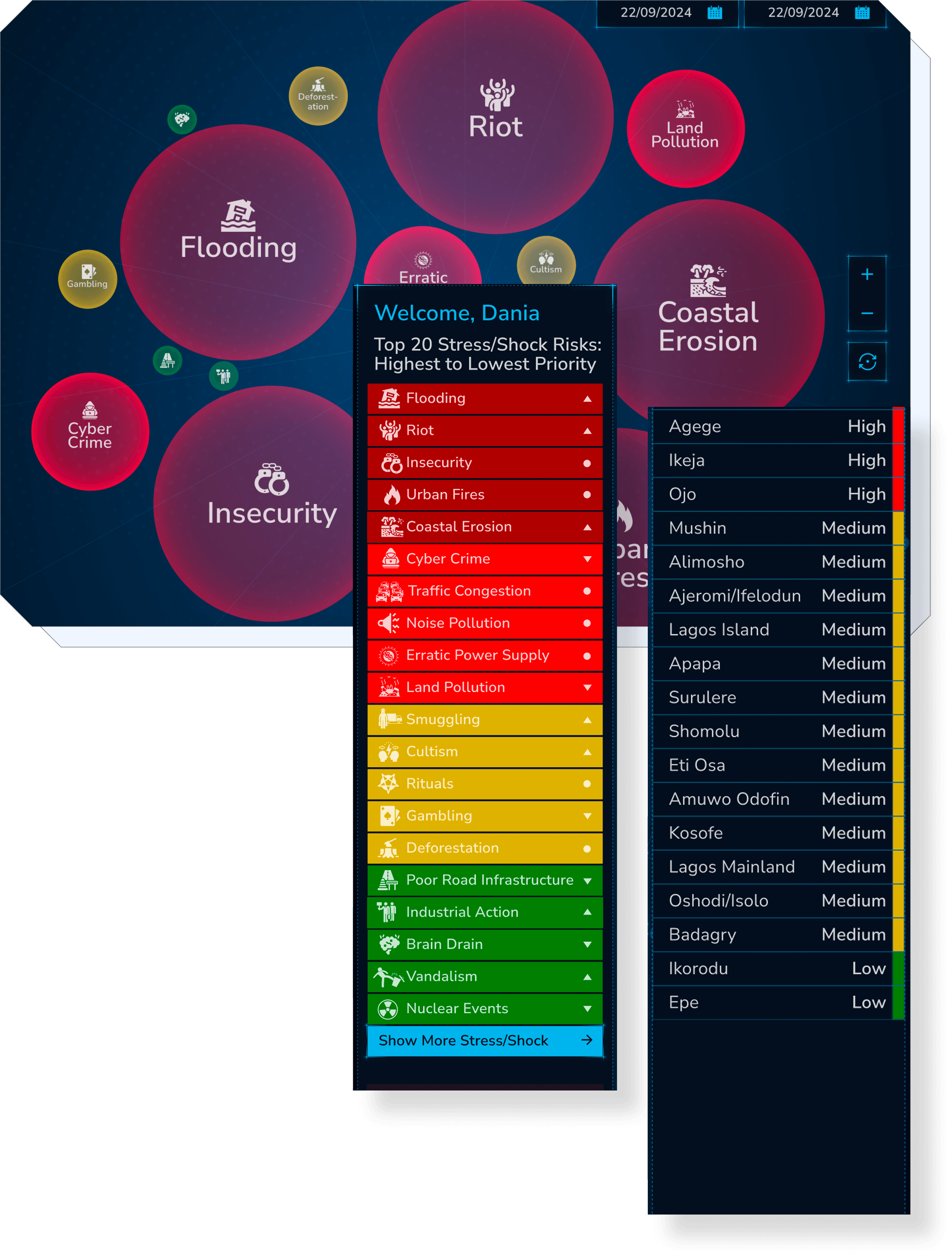
I also built a graph that tracks flood risk over time, so you can actually see it building before it becomes a real problem. Not after someone’s house is already underwater.
Nothing on that screen is there just to look nice. Every color and every ranking is answering one question: what does Lagos need to deal with first?
My Final Outcome
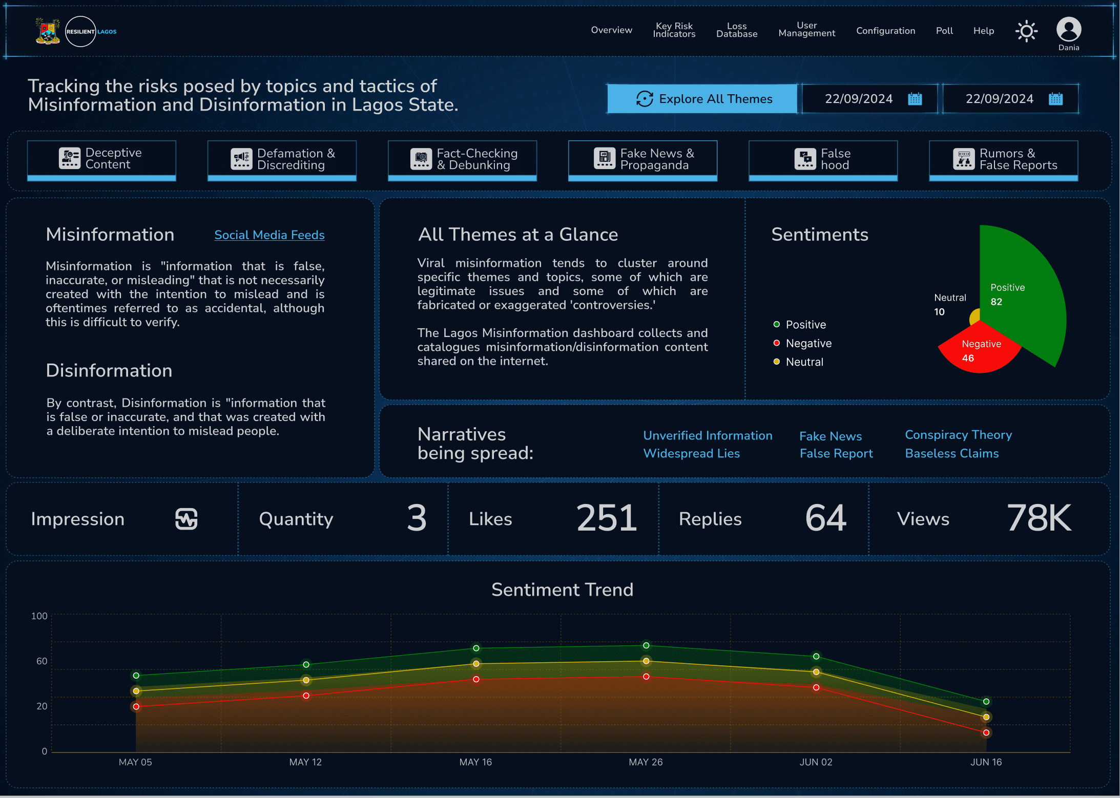
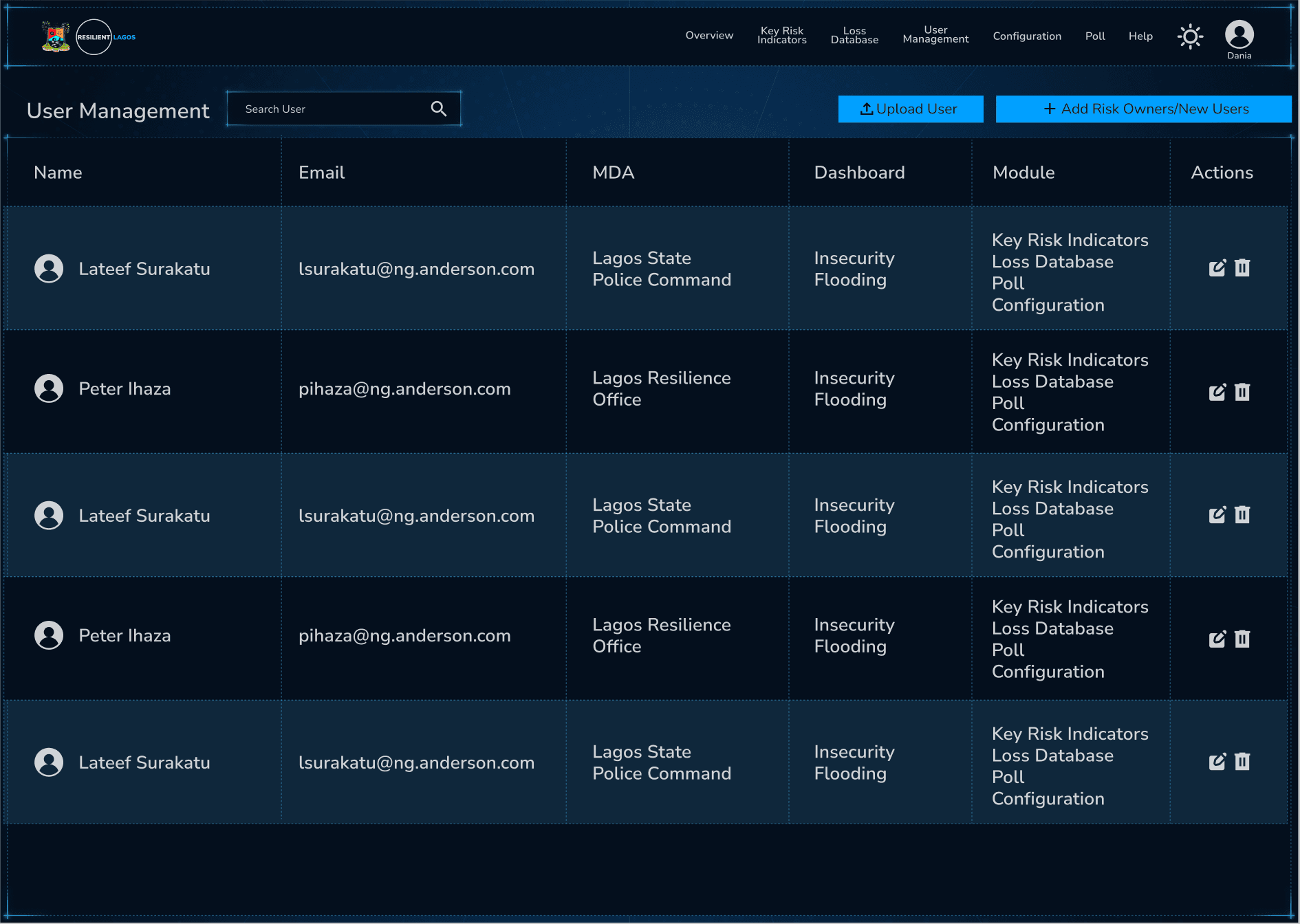
After weeks of audits, iteration, and feedback, the platform went live, a bubble view of Lagos State’s shocks, color-coded by urgency, drilling down into every local government so officials know exactly where to look first.
Gbolabo made my job easier by translating complex product requirements into thoughtful, structured designs that were clear enough to understand and practical enough to build.
- Lagos State Resilience Office
- Andersen Nigeria
- Lagos State Resilience Office
- Andersen Nigeria
- Lagos State Resilience Office
- Andersen Nigeria
- Lagos State Resilience Office
- Andersen Nigeria

Thank
You